Page 05
Accessibility checklist: what to look for on each page
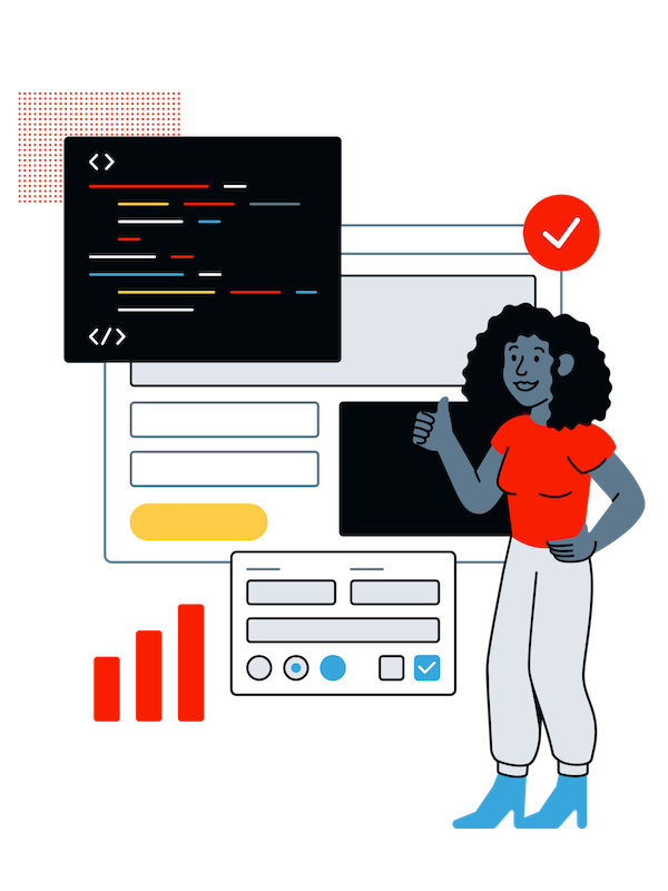
Keep track of your progress with this manual audit spreadsheet.
Make sure your website works for everyone by checking these key areas:
-
Screen reader: Test with popular screen readers like JAWS, NVDA, or VoiceOver. Ensure all elements provide context, can be* accessed easily, and don't "trap" users.
-
Keyboard: Ditch the mouse and navigate only with your keyboard. Note the elements you cannot access or interact with, and watch for lost focus—it may signal a missing focus state or movement to a hidden element.
-
Usability & flow: Is everything intuitive and predictable? Buttons should look and function like buttons, links should look and function like links, and so on. Check the tab order to ensure a smooth, logical experience.
-
Forms: Ensure all forms have the appropriate semantic elements and attributes and have a label to provide context. If a captcha is used, be sure there are alternatives to accommodate different disabilities.
-
Dialog boxes and popups: Make sure dialogs are accessible by using proper semantic elements and managing focus—moving it in when opened, looping within, and returning it when closed.
-
Multimedia: Make media accessible—audio should have transcripts, videos should have captions and descriptions along with pause options for autoplay, and all text-based graphics should have alt text.
-
Links and buttons: Make sure links and buttons use the correct semantic elements and have text that provides enough context to describe the link or action.
-
Logical headings: Use headings correctly—there should only be one H1 per page, and they should follow a logical order. This helps screen reader users navigate efficiently.
-
Skip navigation links: The "skip to main content" link should be the first focusable element on the page, helping users skip past the main menu.
-
Images: Add alt text to all images—use empty alt for decorative ones. You should avoid text in images, but if needed, include it in the alt text.
-
Data tables: Ensure tables have necessary column and row headings, groups, captions, and summaries to aid navigation for all users.
-
iFrame titles: Include descriptive title attributes for iFrames on the page.
-
Colors and contrast: Ensure text has at least 4.5:1 contrast with the background, and UI elements meet a 3:1 ratio. Don't rely on color alone to show actions—use additional cues.
-
Font size/zoom: Users should be able to scale text without breaking the design when adjusting their browser's font-size settings.
-
Touch-friendly elements: Ensure buttons and inputs are a minimum of 24 by 24 pixels for mobile users.
-
Animations: Give users control over the animation and respect their system preferences for reduced motion. (Level AAA).
-
Focus states: Every focusable element must have a focus state. Focus should never be "lost" while tabbing through the page.
As you did with the automated audit, list the issues you find in a document or as tickets in your project management system of choice.